

WttHotM - Brand Identity Project
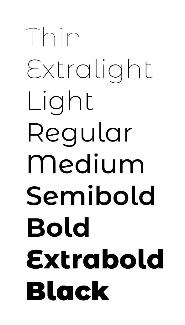
Typography
The brand identity and website are set in the Montserrat Alternates typeface designed by Julieta Ulanovsky.
This typeface was chosen for its visual interest while maintaining legibility at small sizes, and as a compliment to the custom “Miriam Shanks” and “M. Shanks” signatures.
Wordmark - “A wordmark, word mark, or logotype is a distinct text-only typographic treatment of the name of a company, institution, or product name used for purposes of identification and branding.”
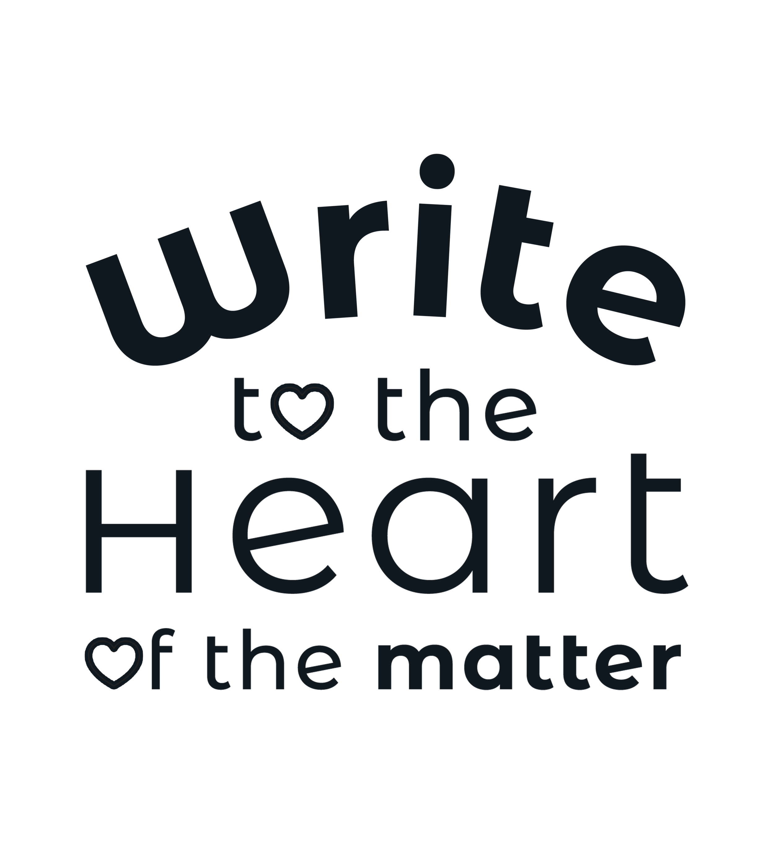
The wordmark, like the website’s typography, is set in the Montserrat Alternates typeface designed by Julieta Ulanovsky.
It is customized in varying weights and replaces the “o” in both "to” and “of” with custom heart icons.
Brandmark - “Brandmarks are the visual elements, images, symbols, and other identifying features of a company's brand that help it stand out from other businesses.”
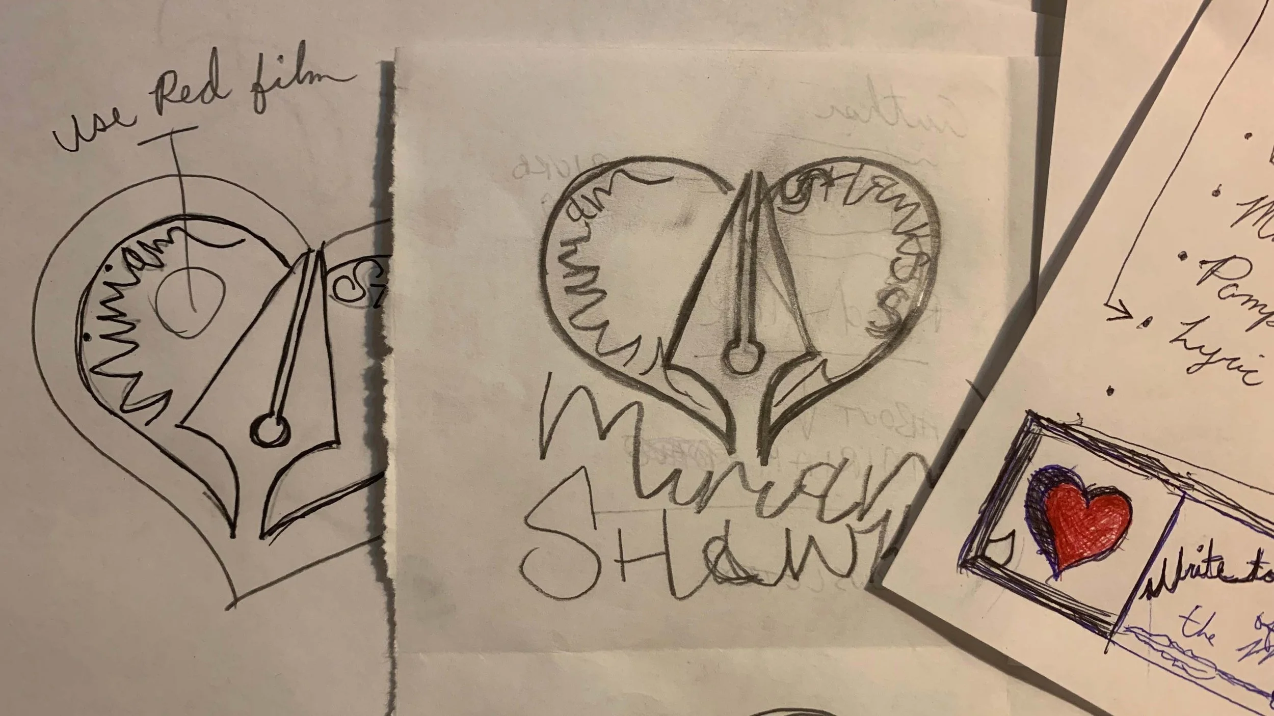
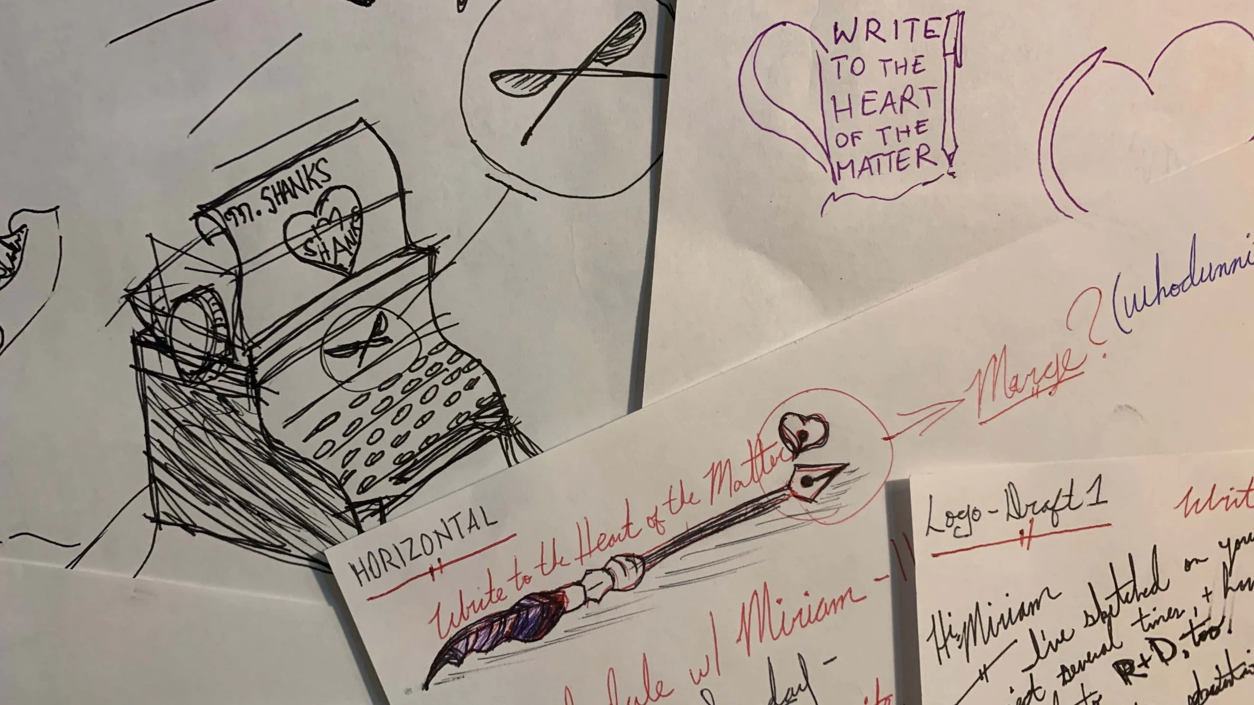
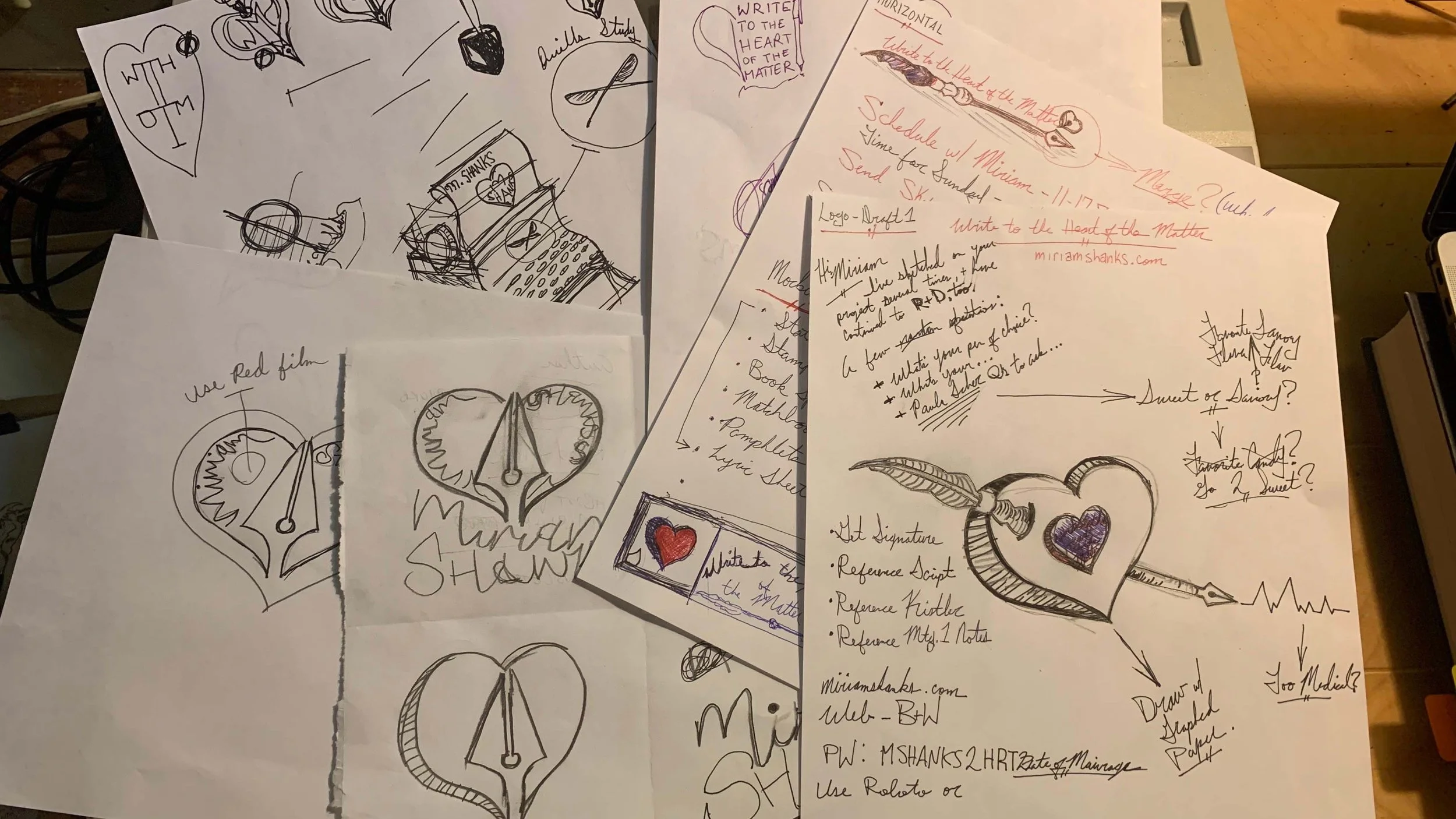
R&D Round 2

R&D Round 1

Color Palette

The second draft color palette. Three light colors, Three dark colors.
11/24 - I added another color palette idea to this section. Do you like the shades of Purple and Lilac?
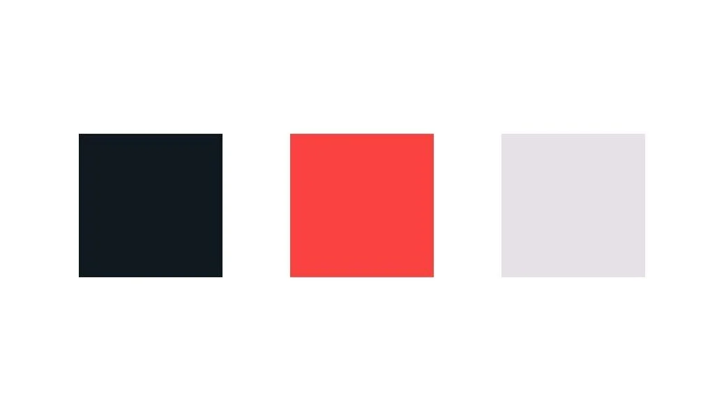
The first draft color palette. Black (Hex Code Here), Red (HCH), Light Grey (HCH)
//